New Web Parts
Button Web Part
The new Button web part is very straight forward. It is a simple way to add a single submit or action button on the page. One example of where I have already used this is on a Branding Center in a new Corporate Intranet. The team wanted to show off some example approved images and then let users know where to get to the rest. I added an image gallery web part with a few example images then added the new Button web part below the rotator to click to view all approved images.

However, it leaves me wanting a few more settings for styling rather than just defaulting based on the theme. Hopefully we get a few more other color options in a future update.
Call to Action Web Part
The Call to Action web part is also a button but with additional options to set a background image, detail text and a clickable button. Recently, I used this to call attention to two top priority topics on a home page of a client’s Intranet, one for Safety (shown below) and one for Benefits. They will allow end users to get to important information quickly and learn that SharePoint is a hub for key policies and procedures.

List Properties
This is Microsoft’s first Modern web part that can be connected to another web part on the same page. I had been missing this option from Classic, so I am glad to see the start of these features returning. To use this part, add a List Web part to the page then connect it to the new List Properties web part to show the properties of each item as it is clicked on without leaving the page.
World Clock
Previously to get a similar clock on SharePoint you needed to go through a 3rd party web part vendor but now it is available out of the box. This is a common request for multi-geo teams. It’s a great way to showcase time zone differences between teammates to highlight the reality of working more globally and help with communication expectations.

Updates to Existing Web Part
News
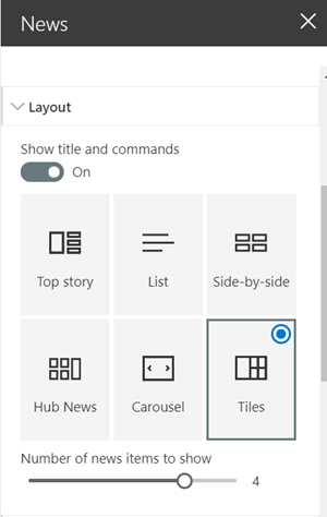
A small but nice addition to the News web part is the new Tile View. I was excited to see this investment in a core web part. The new layout feels similar to the Hero web part. I have started using this option to create a more consistent look and feel between different sites and pages in SharePoint.
Divider
The Divider is just as advertised, a single line on the page but it quite useful. You can use it to break up long pages with long sections of content especially those that don’t contain images to create visual page breaks. In Classic, we had to opportunity to add borders on most web parts, but now I use this web part in a similar way to distinguish between sections. There are two configuration settings 1) Length 20% to 100% of the section area and 2) Height from 1px to 6px.
Highlighted Contents
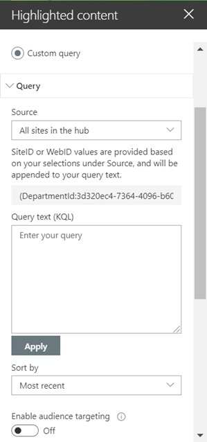
I was a fan of the Content Query and Search Query Web parts from Classic SharePoint and it appears with this change Microsoft is pushing the Highlighted Content web part into a similar vein. This change will allow you to be very specific about what you want to include and NOT include in your results. This was already one of the most useful Modern web parts though sometimes I felt limited by the drop-down box options so this flexibility will add even more power.
Thanks for reviewing my second round of updates but as we know Microsoft is changing all the time so check back for a round 3 to this blog series with some new favorites in a couple months.
 However, it leaves me wanting a few more settings for styling rather than just defaulting based on the theme. Hopefully we get a few more other color options in a future update.


 Thanks for reviewing my second round of updates but as we know Microsoft is changing all the time so check back for a round 3 to this blog series with some new favorites in a couple months.
